Published 3rd Sep 2023
How to create a custom accessible dropdown with React and TypeScript
14 min read
In this article we're going to create a reusable custom accessible dropdown using React. But before we do here's a disclaimer:
It is best to use the native
<select>with<option>elements rather than creating a custom dropdown. This is because the browser native elements handle all accessibility with little input from us. When creating a custom dropdown it will be your responsibility for browser testing across the web, mobile and the various screen reading devices. The component built in this tutorial has not been tested across all devices and assistive technologies.
Lets begin by highlighting the tools we will be using:
- React with Typescript
- Tailwind for styling
The approach of this article is to outline the requirements then show the code, with explanations.
NOTE: I will only show the relevant code to duplication and typing time. The full code will be in a Sandbox link at the bottom of this article.
Expected behaviour
The expected behaviour of the dropdown is as follows for mouse users:
- When I click on the collapsed element, I should expect the dropdown to appear.
- When dropdown is visible, I should be able to select an option by clicking on a list item
- When an item is selected, the dropdown should collapse and the selected item should appear in the collapsed box.
- If the dropdown is visible and I click anywhere outside the list items, the dropdown should collapse
- If no option is selected an error message should appear
The expected behaviour for keyboard users:
- The element should be reached by tabbing (pressing the tab key until I reach the element)
- When the element received focus and I use the UP/DOWN arrows, I should be able to cycle through the options.
- When cycling through the options using the UP/DOWN arrows, the option should be selected automatically
- If press the SPACE bar, the dropdown should appear. If I press the SPACE bar again or the
esckey, the dropdown should collapse. - When dropdown is open, I should be able to cycle through the options by pressing the UP/DOWN arrows.
- I can select an option by pressing the SPACE bar.
- When an option is selected, the dropdown should collapse.
- If an option is selected and I open the dropdown by pressing the SPACE bar, the selected option should receive focus. When I cycle through the options again, focus moves to the next respected option. I can then press the SPACE bar to select the focused option and dropdown collapses.
- If no option is selected an error message should appear.
Expected behaviour for screen readers:
- When I tab to the element I should hear its purpose clear and identifies as
combobox - When the dropdown opens I should hear its opened state
- When I cycle through the options I should her the options clear
- When I select an option I should hear the respected option has been selected.
- When I close the dropdown I should hear the closed state
- If no option is selected and the dropdown has been closed, I should hear an error message.
Hopefully the above required behaviour should be give you an outline of the component we're building and how we expect it to behave.
Component Props
Before diving into the fine details of the component let's first understand the props that we will be passing to it.
This is how we intend to use the Dropdown with the following props:
	<Dropdown
	label='Select address'
	id='address'
	onValueUpdate={update} // receive value from the component
	initialValue={getInitialValue} // for state persistence/load component with an an ini†ial value
	options={[
	{label: '1 High Street', value: '1 High Street'},
	{label: '2 Church street', value: '2 Church street'},
	{label: '40 London Road', value: '40 London Road'}
	]} />
You can add/remove props as you see fit according to your own project.
Interface and types
Let's create a skeleton component to define its prop types
// Dropdown.tsx

import { ErrorType, OptionType } from './Types';

interface IDropdown {
	initialValue?: OptionType; // sets the initial selected option
	onValueUpdate?: (value: any) => void; // set type how you see fit
	options: OptionType[]; // option types. See code block below
	placeholder?: string; // placeholder text to display when no option is selected
	disabled?: boolean; // to disable dropdown
	label?: string; // label text for <label> element
	id?: string // unique identifier for the dropdown
}

const Dropdown = ({
	initialValue,
	onValueUpdate,
	options,
	placeholder,
	disabled,
	label,
	id,
}: IDropdown) => {

	return (

	)
}
// Types.ts
type ErrorType = string | null;
type OptionType = {
label: string;
value: any;
};
export { ErrorType, OptionType }States
Let's create the states needed.
// to store the selected option. Null if there's no initialValue passed as prop
const [selected, setSelected] = useState<OptionType | null>(initialValue || null);
// to keep track of dropdown state - true=open, false=closed. Null initially.
const [dropdown, setDropdown] = useState<boolean | null>(null);
// to store error message when no option is selected
const [error, setError] = useState<ErrorType>(null);
Skeleton build
Now we can create a skeleton build of our component.
We'll have a <label> element.
We'll have one div to wrap our entire component. Inside we'll have a button to act as our <select> element and we'll add ARIA attributes make it accessible.
The options will be displayed in an unordered list.
import { useRef, useState } from "react";
import { ErrorType, OptionType } from "./Types";

interface IDropdown {
	initialValue?: OptionType;
	onValueUpdate?: (value: any) => void;
	options: OptionType[];
	error?: ErrorType;
	helpMessage?: string;
	placeholder?: string;
	disabled?: boolean;
	label?: string;
	id?: string;
	required?: boolean;
}

const Dropdown = ({
	placeholder,
	disabled,
	initialValue,
	options,
	error,
	onValueUpdate,
	label,
	id,
	required
}: IDropdown) => {

	const [selected, setSelected] = useState<OptionType | null>(initialValue || null);
	const [dropdown, setDropdown] = useState<boolean | null>(null);
	const [error, setError] = useState<ErrorType>(null);

	const handleClick = () => {
		setDropdown(!dropdown);
	};

	const handleItemClick = (option: OptionType) => {
		setSelected(option);
		setDropdown(!dropdown);
	};

const getStyle = () => {

	if (selected) {
	return "text-slate-600 border border-green-400 bg-green-50 hover:border-purple-300 cursor-pointer";
	}

	if (disabled) {
	return "border-slate-slate-300 bg-slate-100 text-slate-400 cursor-not-allowed";
	}

	if (error) {
	return "border border-red-500 bg-red-50 text-red-700 hover:border-blue-200 cursor-pointer";
	}

	return "text-slate-600 border-slate-400 hover:border-purple-300 cursor-pointer";

};

	return (
		<>
			{label && <label htmlFor={id}></label>}

			<div ref={ref} className="w-full relative">
				<button
				type="button"
				disabled={disabled}
				id={id}
				// this also handles the 'Enter' key
				onClick={() => handleClick()}
				className={`w-full pl-[25px]
				text-base transition-all rounded-sm border focus:outline
				focus:outline-purple-800
				${getStyle()}
				`}
				>
					<div className="flex flex-row justify-between items-center h-
					[60px]">
						<p id={`${id}-option`}>
						{selected ? selected.label : placeholder || "Please Select"}
						</p>
					</div>
				</button>

				{dropdown && (
					<ul
					className="max-h-80 overflow-y-auto bg-white z-50 absolute w-full border-b border-l border-r"
					>

					{options && options.map((option: OptionType, i: number) => (
						<li
						className={`w-full text-sm text-slate-600 p-5 border border-transparent cursor-pointer hover:bg-purple-50 focus:outline-2 focus:outline-purple-800
					   ${ selected === option && "bg-purple-200 text-slate-900" }
					   `}
					    onClick={() => handleItemClick(option)}
					    >
							{option.label}
						</li>
					))}
					</ul>
				)}
			</div>
		</>
	);

};

export default Dropdown;
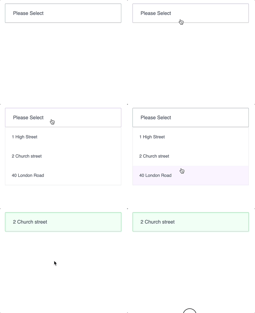
This is what we have built so far:
Keyboard navigation
As mentioned earlier we need to add some keyboard navigation for keyboard users. We can begin by adding allowing the UP/DOWN arrows to cycle through the options when the box (<button>) receives focus.
Using Up/Down arrows to cycle through the options.
First we'll add an onKeyDown listener to the <button> and write a function to handle the pressed keys.
There are 2 scenarios to consider here:
- Dropdown is closed and the UP/DOWN key is pressed. In this case we'll need to cycle through the options and select them.
- Dropdown is open, no option is selected yet and the UP/DOWN key is pressed. In this case we'll need to set the focus on either the first or last option depending on which arrow key is pressed. We will need to create a
refand attach it to the<ul>element for this to work. Once the focus has shifted to the respected list item we will need to handle the navigation from the<li>. This will be covered in the next section.
	const ulRef = useRef<HTMLUListElement>(null);
	.
	.
	.

	const handleKeyDown = (e: React.KeyboardEvent<HTMLButtonElement>) => {

	switch (e.key) {
		case 'ArrowDown':
		e.preventDefault();

		// if dropdown is open and no option is selected then focus on
		// the first list item
		// Once focused on the first list item we will need to handle navigation
		// from <li>. This will be covered in the next section.
		if (dropdown && selected === null && ulRef.current) {
			(ulRef.current.childNodes[0] as HTMLLIElement).focus()
			break;
		}

		// regardless of dropdown is opened/closed, if no option is selected
		// then select the first option
		if (selected === null) {
			setSelected(options[0])
			break
		}

		// if an option is selected and we're on the last option then
		// select the first option
		if (selected && (options.indexOf(selected) === options.length -1)) {
			setSelected(options[0])
			break;
		}
		// if option is already selected then select the next option down
		if (selected) {
			setSelected(options[(options.indexOf(selected) + 1)])
			break;
		}

		break;

		case 'ArrowUp':
		// same logic as above but in reverse
		e.preventDefault();
		if (dropdown && selected === null && ulRef.current) {
			const lastIndex = ulRef.current.childNodes.length - 1;
			(ulRef.current.childNodes[lastIndex] as HTMLLIElement).focus()
			break;
		}

		if (selected === null) {
			setSelected(options[options.length -1])
			break;
		}

		if (selected && (options.indexOf(selected) === 0)) {
			setSelected(options[options.length -1])
			break
		}

		if (selected) {
			setSelected(options[(options.indexOf(selected) -1)])
			}
		break;

		default:
		break;
	}

}

	return (
		...
		<button
		type="button"
		disabled={disabled}
		id={id}
		onClick={() => handleClick()}
		onKeyDown={e => handleKeyDown(e)}
		>
		...
		</button>

		{dropdown &&
			<ul ref={ulRef}>
			</ul>
		}
	)
Selected option exists and dropdown actives via keyboard
If a user has already selected an option and activates the dropdown, then the focus must move to the selected item. This can be achieved by running a useEffect listening every time the dropdown changes state. We will attach the ulRef to the <ul> and set the focus to its selected child element.
	const ulRef = useRef<HTMLUListElement>(null);
	.
	.
	.
	useEffect(() => {
		if (dropdown && ulRef.current && selected) {
			(ulRef.current.childNodes[options.indexOf(selected)] as HTMLLIElement).focus();
		}
	}, [dropdown]);

...

	return (
		...
		<ul
		ref={ulRef}
		>

		</ul>

	)
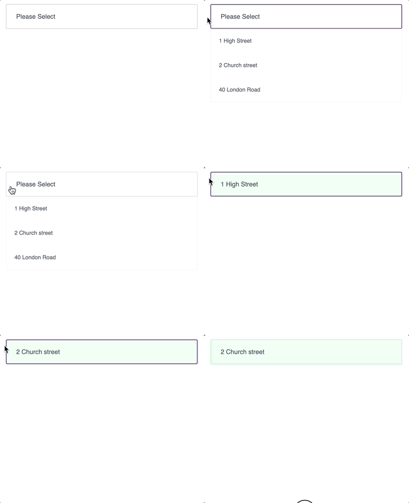
The component should now be functioning like this:
Cycling through the options once dropdown is open
The dropdown can be activated by pressing the Enter or space key. Once activated we can navigate to the first or last option as explained above. At the moment, the dropdown cannot be reached by pressing the tab key as 1) it's a non interactive element; and 2) it does not have a tabIndex attached.
If we assign tabindex={0} to the <li>s once dropdown is open then the user will be able to reach all of the list items. However, the caveat is that once the last item is reached and the tab key is pressed once more, the focus will move to the next element on the page and the dropdown will remain open - leaving an unpleasant user experience.
To address this, we can either disabled the tab on the list items, or trap the user in the dropdown. The approach I used is the former - disabling the tab key once inside the list. I have used this approach based on the native HTML radios behaviour - that is you can only navigate between the radios using the arrows.
Closing the the dropdown while in the listbox:
We will need to handle the closing of the dropdown when the esc key is pressed
Selecting an option:
A user can select an option by pressing the space bar. Once selected we will need to return the focus to the <button>. We will do this attaching a ref to the button.
We will also attach an onKeyDown listener to the to the <li>s and write a function to handle the various key presses including navigation, selecting and closing.
...
	const buttonRef = useRef<HTMLButtonElement>(null);

	// we will call this function everytime we want to close the dropdown while
	const collapse = () => {
		setDisplay(false); // close the dropdown
		if (buttonRef.current) buttonRef.current.focus() // focus on the button
	}

	const handleOptionKeyDown = (e: React.KeyboardEvent<HTMLLIElement>, option: OptionType) => {

		switch (e.key) {

		case "ArrowDown":
		e.preventDefault();
		// if there's a next item, focus on it
		if (e.currentTarget.nextSibling) {
			(e.currentTarget.nextSibling as HTMLLIElement).focus();
			break;
		}

		// if there's no next list item (last item), focus on the first item
		if (!e.currentTarget.nextSibling) {
			(e.currentTarget.parentNode?.childNodes[0] as HTMLLIElement).focus();
			break;
		}
		break;

		case "ArrowUp":
		e.preventDefault();
		// if there's a previous item, focus on it
		if (e.currentTarget.previousSibling) {
			(e.currentTarget.previousSibling as HTMLLIElement).focus();
		break;
		}
		// if there's no previous list item (first item), focus on the last item
		if (!e.currentTarget.previousSibling && e.currentTarget.parentNode) {
			const indexOfLastElement = e.currentTarget?.parentNode?.childNodes?.length - 1;
			(e.currentTarget.parentNode?.childNodes[indexOfLastElement] as HTMLLIElement).focus();
		break;

		}
		break;

		case "Tab":
		// disabling default Tab behaviour
		e.preventDefault();
		break;

		case " ": // space bar
		// select the option and call the collapse function
			setSelected(option);
			collapse();
		break;

		case "Escape":
		e.preventDefault();
		// call the collapse function
		collapse();
		break;

		default:
		break;
	}

	};

return (
	...
	<button
	ref={buttonRef}
>
	</button>

	{dropdown &&
	<ul ref={ulRef}>
	{options && options.map((option: OptionType, i: number) => (
		<li
		onClick={() => handleItemClick(option)}
		onKeyDown={(e) => handleOptionKeyDown(e, option)}
		// only reachable if dropdown is active
		tabIndex={dropdown ? 0 : -1}
        >
			{option.label}
		</li>

	))}
	</ul>
	}
)
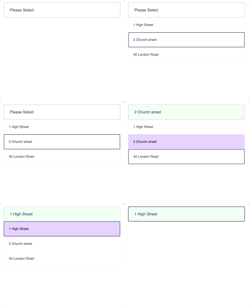
So far we have built this:
Display error when no option is selected
Let's add an error state when the dropdown has been closed and no option has been selected.
Keyboard
We can do this by running a useEffect that triggers every time the dropdown's state changes and checking if selected === null.
We will also need to create an error state that will store the error and use it to display a message
...
	const [error, setError] = useState<ErrorType>(null);

	useEffect(() => {
		// if no option is selected on click outside, set error
		if (dropdown === false && selected === null) {
			setError("Please select an option.");
		} else {
			setError("");
		}

	}, [dropdown]);

...
	return (
		<div>
			<button>
			</button>

			{dropdown && ...
				<ul>
				...
				</ul>
			}

			{error &&
				<p className="pt-2 text-red-700">{error}</p>
			}
		</div>
	)
Mouse click
To display an error when a clicking outside the dropdown we'll need to add an eventListener on the DOM. We'll do this in a useEffect. We will also consider the case if dropdown === null i.e. has not been activated yet. Because if we click outside box while dropdown === null, the callback function in the eventListener will fire anyway and will close the dropdown i.e. setting dropdown === false. If dropdown === false then the above useEffect in the previous code block will run and an error will display prematurely i.e. the we haven't even had a chance to open the dropdown and we have an error already! Not a pleasant user experience.
To solve this we will check if the previous state of the dropdown is true. If it is then set it to false and the useEffect above will run beautifully. If previous state is not true i.e. could be false or null ( we are interested in null ) then keep it as null. The useEffect will still run but it will not meet the if condition and hence no error will be displayed.
...

	// handle outside clicks
	useEffect(() => {
		const handleClickOutside = (e: MouseEvent) => {
			if (ref.current && !ref.current.contains(e.target as Node)) {
				setDropdown((prev) => (prev ? false : null));
			}
		};

		document.addEventListener("mousedown", handleClickOutside);

		// cleanup call back function
		return () => document.removeEventListener("mousedown", handleClickOutside);

	}, []);
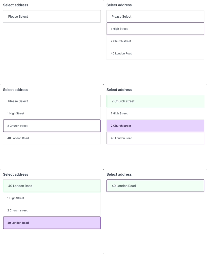
We now have this behaviour:
Accessibility and screen readers
For the component to be accessible and helpful for screen readers we need to appropriate ARIA attributes. For the purpose of this I have used Chrome's screen reader extension, created by Google, to test the component.
Combox, listbox, has popup, option and expanded
Since this is a custom <select> component we'll need to add role=combobox to the button. We will also need to tell it that this button has a 'pop up' - the dropdown - and the nature of the popup is a listbox. Since the dropdown is a list of items we'll add a role='listbox' to the <ul> and attach role=option to the <li>s.
The expanded attribute tells the screen reader if the combobox is expanded (true) or closed (false)
...
	return (
		...
		<button
		role='combobox'
		aria-haspopup="listbox"
		aria-expanded={dropdown ? dropdown : false}
		>
		...
		</button>

		<ul
		role='listbox'
		>
			<li
			role='option'
			>
			</li>
		</ul>
	)
Ids, labels, selected, invalid, controls
To ensure the interactivity via a screen reader is seamless we'll need to set appropriate pointers to tell it what element(s) the <button> controls.
aria-selected
To tell the screen reader which element is selected we need to an aria-selected to the list item, true if selected, else false.
aria-label
The aria-label is read out to the user by a screen reader. Let's add it to the list items and set it to the respected option.label. We'll also add an aria-label to the <button> so it reads out the text content of the button.
aria-invalid
This is a boolean and it helps to tell the user if there are any errors. We'll add it to the <button>. Since our error state is of type string, we'll add a ternary operator to set to true or false.
aria-controls
The aria-controls must be set to the id of the element that it controls. In our case it's the listbox id, so these 2 ids must match.
The reason I had used
${id}-listboxis so that in the case of having multiple dropdowns on the same page the controls don't clash and cause unexpected behaviour. So we're adding another unique layer to the ids.
...
	return (
		...
		<button
		role='combobox'
		aria-haspopup="listbox"
		aria-expanded={dropdown ? dropdown : false}
		aria-label={selected ? selected.label : placeholder || 'Please Select'}
		aria-controls={`${id}-listbox`}
		aria-invalid={error ? true : false}
		>
		...
		</button>

		<ul
		role='listbox'
		id={`${id}-listbox`}
		>
			<li
			role='option'
			aria-label={option.label}
			aria-selected={selected === option}
			>
			</li>
		</ul>
	)
Error states for screen readers
All we need to do to make the screen reader read the error message is to add aria-live attribute. We can set it to either assertive, off, or polite. To read about the difference between these you can check the MDN Docs. We're going to use the aria-live="assertive" as we need it to be read promptly as soon as the error mounts.
	return (
	...

		{error &&
			<p className="pt-2 text-red-700" aria-live="assertive">{error}</p>
		}
	)
Slip-up
While writing the tutorial I had forgotten to add the label text inside the <label> element.
...
	return (
		<>
		{label && (
		<label
		htmlFor={id}
		className="block pb-3 text-lg text-slate-600 font-semibold"
		>
			{label}
		</label>
		)}
		...
		</>
	)
Receiving value in parent component
Finally, once an option has been selected, we can call the onValueUpdate and pass the value like so:
...

	useEffect(() => {
		if (onValueUpdate !== undefined && selected) {
			onValueUpdate(selected.value)
		}
	}, [selected])
All done
And there you have it! An accessible dropdown for all users.
Please keep in mind this has not been tested across various assistive technologies and should you choose to implement this component, do it at your own risk.
Full code
If you want to see the full code I've created a sandbox: https://codesandbox.io/s/dropdown-89wk64
Looking forward to your feedback :)


